Skip to content →

Category: web

color schemes

In the unlikely event that we will ever be publishing a
_series_ of books, we’d better have a strategy to design the
_next one_ as we don’t want to go through this time-consuming
process each time. So we need a concept, a consistent
lay-out and a consistent color scheme.

Think of the O’Reilly
hacks books
. Their concept is to have a white background with a
black&white photo of a tool on it, their layout is : a huge colored
title at the top and the authors at the bottom, their color-scheme is
set according to the topic but always using just one color! Pretty
simple, but extremely effective in creating a common look-and-feel for
the series.

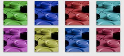
Our concept is to take a macro photo of a
mathematical game in duotone
.

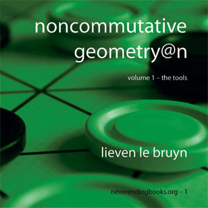
Clearly, the game will vary throughout the series and may
even depend on the author (the example-game is Gipf). Duotone (that is,
converting the photo to grayscale and replacing white by another color
and adjusting saturation) because we are no graphic designers and have
no control on the final result if we would go for something more
involved.

Of course, the second color will also change
throughout the series. As we have no time to read interesting books such
as the color harmony workbook we just went for a
variation of the triad
color idea
. That is,

Any three colors
with a balanced triangular relationship are triads. The basic triad
consists of three colors equidistant on the color wheel. The best known
of all color schemes are: the primary colors, red, yellow, and blue; the
secondary colors, orange, green and violet; and the remaining tertiary
colors, like red-orange and blue-violet. Triadic colors are usually
considered pleasing to the eye.

Given the
first color, we add first 120 and then 240 to its hue-value. For the 4th
color we take the opposing color (+180) and the 5th and 6th colors make
a second triad. For the 7th color we then have to go for +150 and form
another triad and so on and so on. An example of how such a series might
look is given at the top.

Finally, as for the lay-out, well,
it’s far from perfect but it’s the best we managed to do before
we got fed up with it. But, perhaps you might appreciate the stylish
hyphens in subtitle and in the numbering line, compatible with our own
chapterstyle.

Leave a Comment

design decisions

We are nearly done, I hope. One can keep on tweaking
parameters endlessly, so at regular intervals we grab our chief graphics designer and tell him :
decision time! which of the two is best? At the moment, we decided on
our own chapter-style \chapterstyle{neb} which is an
adaptation of the _demo-style_ in
memoir.cls
(see on the left). We also have our own page-style which
is an adaptation of the _companion-style_ (the house-style of the
LaTeX Companion series).

You
will notice that the page-format is a bit odd. As mentioned before, we
didn’t want to copy the _regular_ mathematics-book -look.
We went for a fun format (square, 7.5 by 7.5 inch ; think of an inflated
CD-box) as well as a handy one (so we will go for _spiral-bound_
books). The reason for this is that we noticed that the most consulted
copy of version 2 around at the department is
Stijn’s which has a nice coil binding so you can always lay it
nicely flat on a desk, whether you just want to look something up, or
use it to explain something at the blackboard.

Perhaps you can
even see that the font is slightly smaller than the _regular
10pt_. Memoir allows for a _9pt font_ and this looks _so
much_ better. Besides, it helps to keep the number of pages
reasonable, and related to this : keep the production costs low. At the
moment the plan is to be able to sell a book of say 260 pages under 13
Euros (that is, 5 EuroCent/page), but more on this next week.

What else? Well, recently, we decided on the
_copyright_-license (at least for the first book). Clearly, all
neverending-books will have their own ISBN-number
and the copyright is one of the
Creative Common
Licenses. At first we thought of taking the same one that protects
(however, see mewt’s story
) this site and which is, in technical terms, a by-nc-nd:be
license
. But, in the end, we decided to go for a Developing Nations
License
. Here\โ€šร„รถโˆšร‘โˆšยฅs why :

The Developing
Nations license allows, for the first time, any copyright holder in the
world to participate first-hand in reforming global information policy.
The fact is that most of the world’s population is simply priced
out of developed nations’ publishing output. To authors, that
means an untapped readership. To economists, it means “deadweight
loss.” To human rights advocates and educators, it is a tragedy.
The Developing Nations license is designed to address all three
concerns.

So, what else needs to be done by next
week when we hope to launch our first book? Well, I need to write some
_blurb_ and we have to decide on front- and back-covers.
Tomorrow, I hope to report on how that one ended.

Leave a Comment

neverending.sty

You don’t
know how lucky you are to be able to begin a LaTeX-document with
something like \documentclass[a4]{amsart}. This simple line
tells the machine what the size of paper is it has to print to, which
part of that paper has to be filled with text, what the design of
titles, sections etc. is (and probably more). Just convince yourself
(for the sake of argument) that you want to produce a readable
mathematical book on paper of dimensions say 6 by 9 inch. How would you
do this? Simple : all you have to do is to adjust certain TeX-parameters
the way you want! Well, that’s exactly what the _neverendingbooks
design department_ has been doing for the last couple of weeks!

The package we would use was easy enough to find. A long time ago, Geert suggested that we
should use the
memoir package
. The fun starts the moment you are foolish enough to
print the manual : 300 pages! After an inspiring account of
book-printing basics over the ages, you are told that you have total
freedom to set your _stock paper size_, how it needs to be
_trimmed_ to get the final result, how you should designs
everything from the title, over abstract, acknowledgement, thanks, table
of contents contents, dedications etc. down to chapter, section and page
styles. In short : ULTIMATE FREEDOM!!!

But, as some of you may
know from experience, there is nothing more frightening to the moderate
autist (and frankly, are there any other mathematicians?) than ultimate
freedom! So, we set up a task-force, had daily brain-storm sessions,
produced numerous trial-prints and eventually came out with something
that came very close to the _better designed book_. Let’s face it
: can you name me _one_ (yeah right, just 1) well-designed
mathematical book? If you don’t believe me, browse through the recent
mathematics-books on amazon (as our design-department
did for a whole week-end, deprived of beverages and other pleasures).
Found anything? Yes?? Please, please let us know! On the other hand, if
you browse through the Art, architecture and
photography section
you will spot several extremely good-looking
books very soon. Well, after a week we succeeded in designing the
_arty-farty-fanshi-wanshi_ (as PD1 would name it, jealous that
she was not in on the fun) mathematical book! And, what did we do with
the labours of all this hard work? NOTHING! We simply dropped the whole
idea (if you are a graphics-designer trying to survive within a
mathematics publishing firm (not easy we know, you have all our
sympathy) and want to do something more fun, contact us and if we can
reach an adequate financial agreement we will be happy to send you our
ideas).

So, what went wrong? Nothing really, it just dawned on
us that _NeverEndingBooks.org_ should not go for the
better-designed mathematics book. All our (potential) authors can
publish as easily at Oxford University
Press
, the European Mathematical
Society
or, if they have no moral objection, at the AMS. So, why
would they choose us instead of these more established publishing
houses? Just because our books look slightly (well let’s face it : a
lot) better? Probably not. We, at neverendingbooks.org should not go for
the better-designed book, we should not go for the book concept at all,
we should invent something entirely NEW & SEXY & USABLE & DESIRING & (I
hope you get the drift!). Next time, I’ll let you in on the first ideas
of our design-department!

Leave a Comment